
Feedback
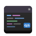
Feedback widgets interrupt or annotate the current view to tell the user something: a toast slides a transient message over the content, while a dialog puts a modal surface in front of it and waits for a response. Adwaita draws them as real windows or floating sheets — a toast overlay layered above the page, an alert with a row of responses, the standard About window, a preferences sheet built from boxed lists.
Every widget below is described independently of any one toolkit, then shown
three ways. Native GJS (real Libadwaita through
@girs/adw-1) is the primary
implementation; the Web (@gjsify/adwaita-web)
and NativeScript (@gjsify/adwaita-nativescript)
ports mirror it.
A toast is a transient notification — a short line of text, optionally with a single action button, that floats over the content for a few seconds and then dismisses itself. It is shown through a toast overlay that wraps the page and layers toasts above the bottom edge, so it never displaces the content beneath.
The overlay shows one toast at a time: adding a toast while another is
visible queues it, and it appears only once the visible one is dismissed — by
its timeout, its close button, its action button, or an explicit dismissal. All
three ports share that queue: it lives in the headless
@gjsify/adwaita-core
layer, which the Web and NativeScript renderers compose.
Alert Dialog
Section titled “Alert Dialog”An alert dialog is a modal message: a bold heading, some body text, and a row of responses the user must choose between. Each response is a button with a string ID; one may carry a destructive or suggested appearance, and a default and close response govern the Enter / Escape keys.
About Dialog
Section titled “About Dialog”An about dialog is the standard application “About” window: a large app icon, the application name, a developer line and a version pill, with navigation into Details, Credits and Legal sub-pages built from the app metadata. It is the conventional destination of a primary-menu About entry.
Preferences Dialog
Section titled “Preferences Dialog”A preferences dialog is a settings window organized into pages, each holding groups of boxed-list rows — switches, drop-downs, spin buttons. It is the multi-page container behind an application’s Preferences command; the common single-page case is shown here.
Related
Section titled “Related”- Boxed Lists — the preference rows a preferences dialog is built from.
- Presentation — the windows, header bars and views these overlays sit above.
- Adwaita Storybook — the same widgets in a live, interactive component browser.